


Have you been hogging on Domino’s pizza without batting an eye on its logo? Have you been piling Nike and Adidas, and unscrupulously Googling your questions, conveniently ignoring the symbols? You didn’t even care when Wikipedia saved your day?
Well, regret no more because here is a list of some subliminal logos of famous brands that finely capture what they serve.
While logos may be a simple representation of brands, they say way more than we perceive.
These basic shapes are known to convey subtle messages that mould the audience’s connection with the brand. There is a story behind every logo, much more than what meets the eye. And, telling a good story only makes a good logo.
Let’s have a look at some of the classy logos and their hidden meaning:
1. Adidas logo motivates you to work harder.
The famous clothing and accessories brand, Adidas incorporates three stripes in its logo. These slanted lines form a triangle. It symbolizes a mountain, a metaphor for the challenges and perceivable goals that all athletes must meet and overcome.
2.Wikipedia logo is a hub of information.
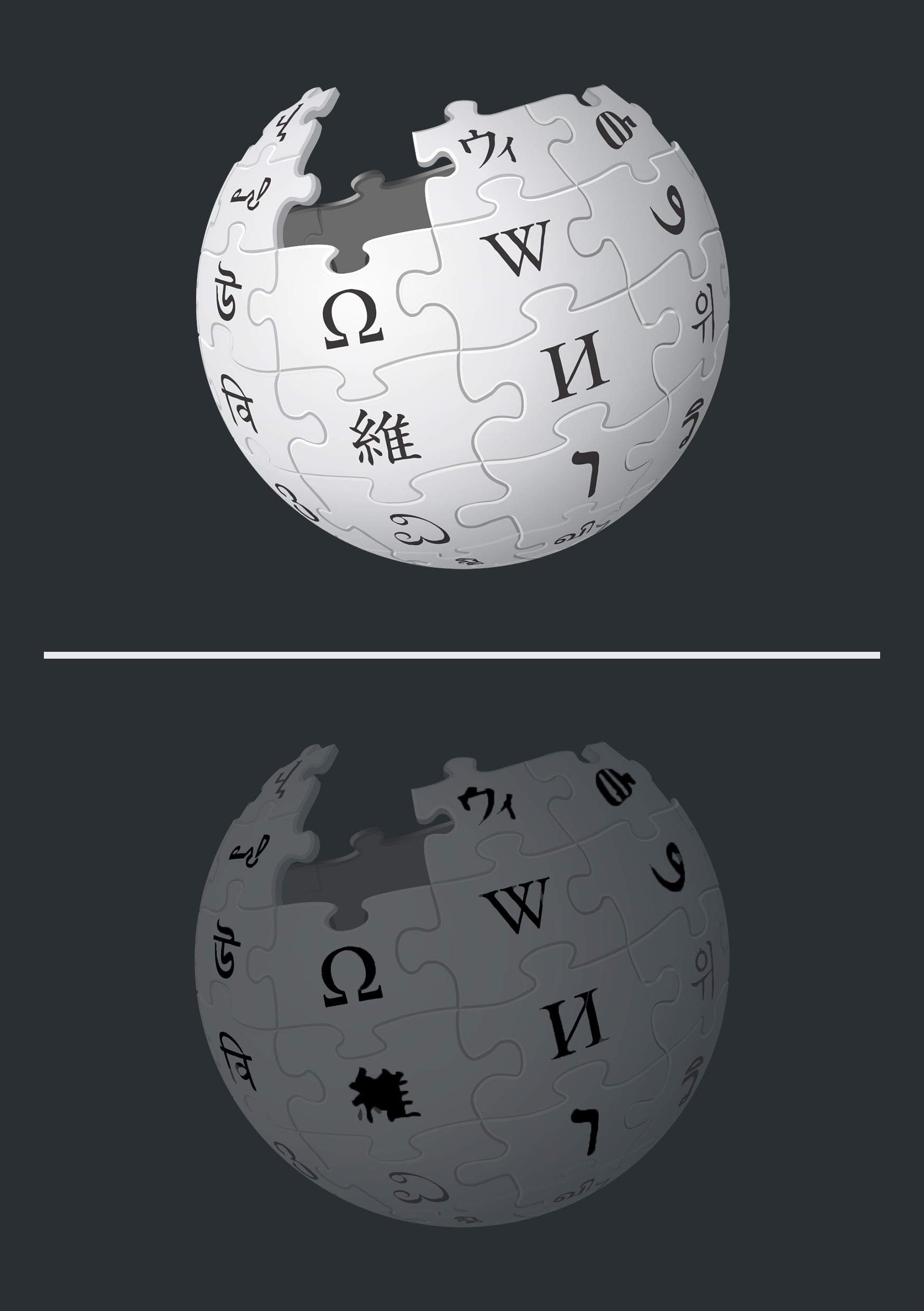
Believe it or not, the Wikipedia logo you might cast a glance at on a daily basis has a hidden meaning. The logo is a globe comprising puzzle pieces with characters belonging to different languages. The globe, however, is incomplete, representing the “incomplete nature” of Wikipedia’s goal to be an online encyclopedia for people versed in any language. Also, since it is a site built upon user submissions, is always increasing in breadth, and hence, never complete.
3. The Amazon logo represents diversity delivering smiles.

The arrow in the Amazon logo connecting A to Z represents the idea that Amazon store sells everything from A to Z, a brilliant concept that is also in the name of the business; as in the biodiversity one would find in the Amazon forest. But if that’s not enough, the arrow also represents a smile suggesting the experience that shopping is.
4. Le Tour De France logo subliminally tells us to be focused.

Interestingly enough, Le Tour De France logo contains a hidden cyclist shaped by the letter “R” and “U” riding a cycle whose wheels are made by the letters “O”. The last “O” is colored in yellow, the same color of the famous Jersey given to the winner of the event. On a more subjective level, the yellow wheel also suggests the idea of a sun; as the event runs in the summer.
5. Google Logo Is A Rebel
The Google logo might seem pretty basic on the surface displaying the company’s name in a clean and colorful font. But if you are a keen observer, you’ll notice the quirky logo uses the three primary colors, red, yellow and blue—and then there’s that green “L” near the end that throws the whole primary color scheme out the window. This breach of pattern symbolizes Google’s philosophy of being an innovator and not playing by the rules.
6. Baskin Robbins’ logo offers variety in taste.

The sumptuous ice cream chain, Baskin-Robbins, offers 31 flavors of ice-cream. The number 31 is hidden in the logo within the letters of B and R.
7. Dell logo gives you the power to do more.
Dell is a reputed computer technology company. In its logo, you’ll notice that the “E” in Dell is lopsided. It represents company founder Michael Dell’s motto to “turn the world on its ear.”
8. Toblerone logo inspires taste.
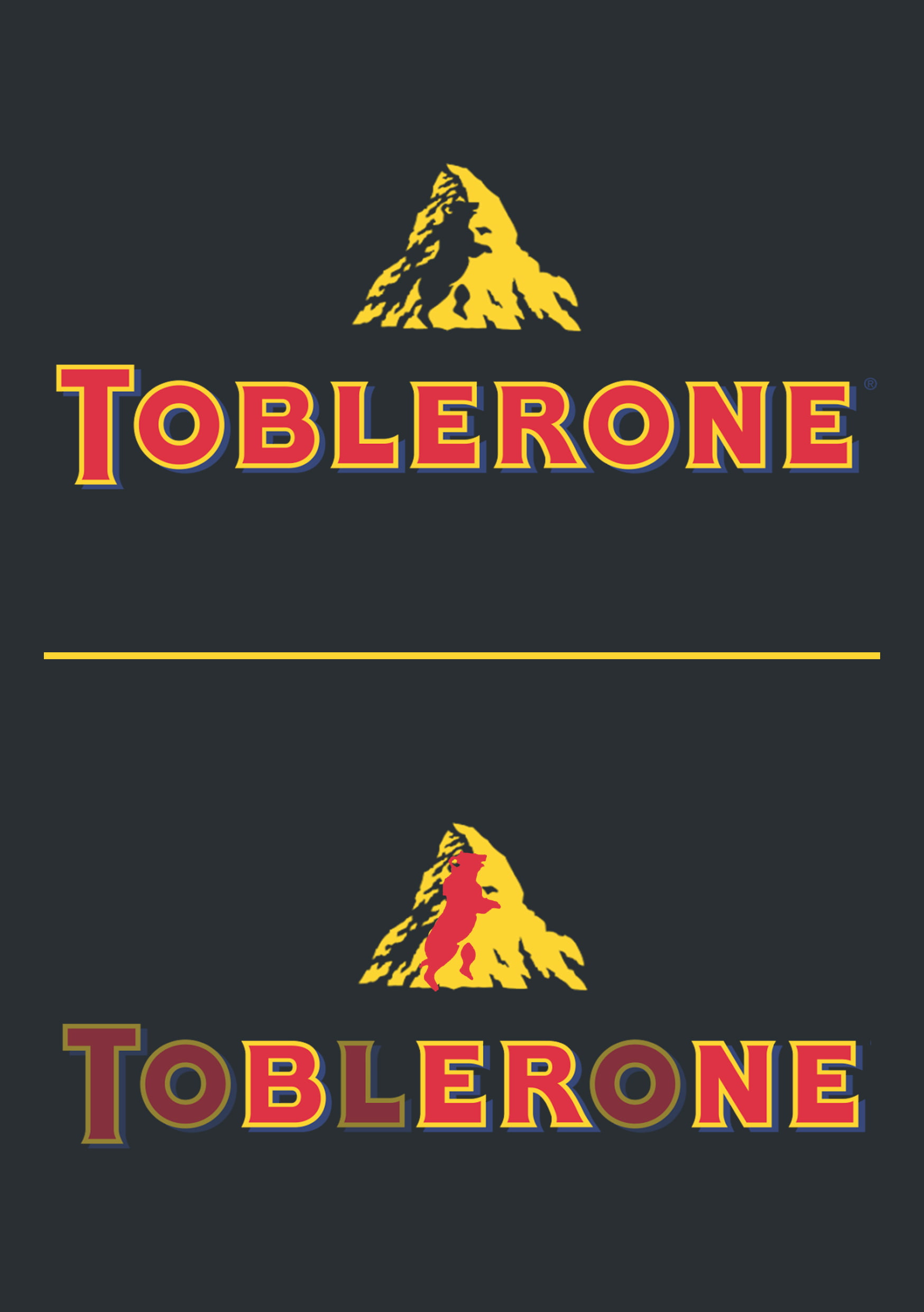
The Swiss chocolatiers at Toblerone are known for their unique triangle-shaped chocolate bars and their logo featuring a picture of the Matterhorn, symbolizing the product’s country of origin.
But there’s something hidden in that Matterhorn peak for the viewer with a keen eye. The logo has a hidden bear in the snows on the mountain top. Why a bear? Because Toblerone is made in Berne, Switzerland, and the bear is the symbol for Berne. Even the word ‘Toblerone’ itself is hiding all the letters to spell out the word “Berne.”
9. Beats Audio logo defines listening in style.
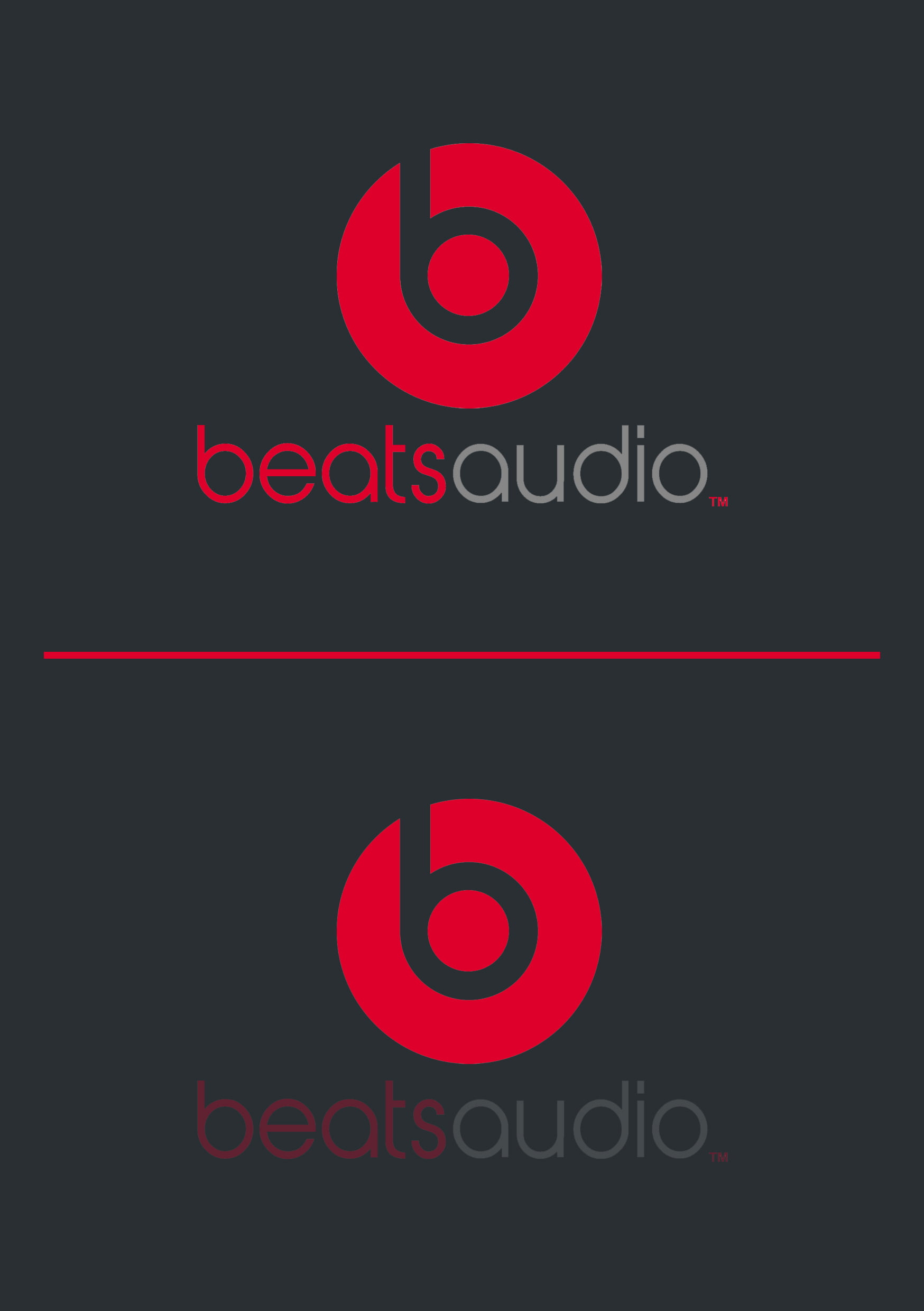
One of the leading audio products manufacturers, Beats audio’s logo is a stylized side view of a person wearing the much-coveted headphones, the company’s flagship product.
10. Picasa logo gives you the one storehouse for all your memories.
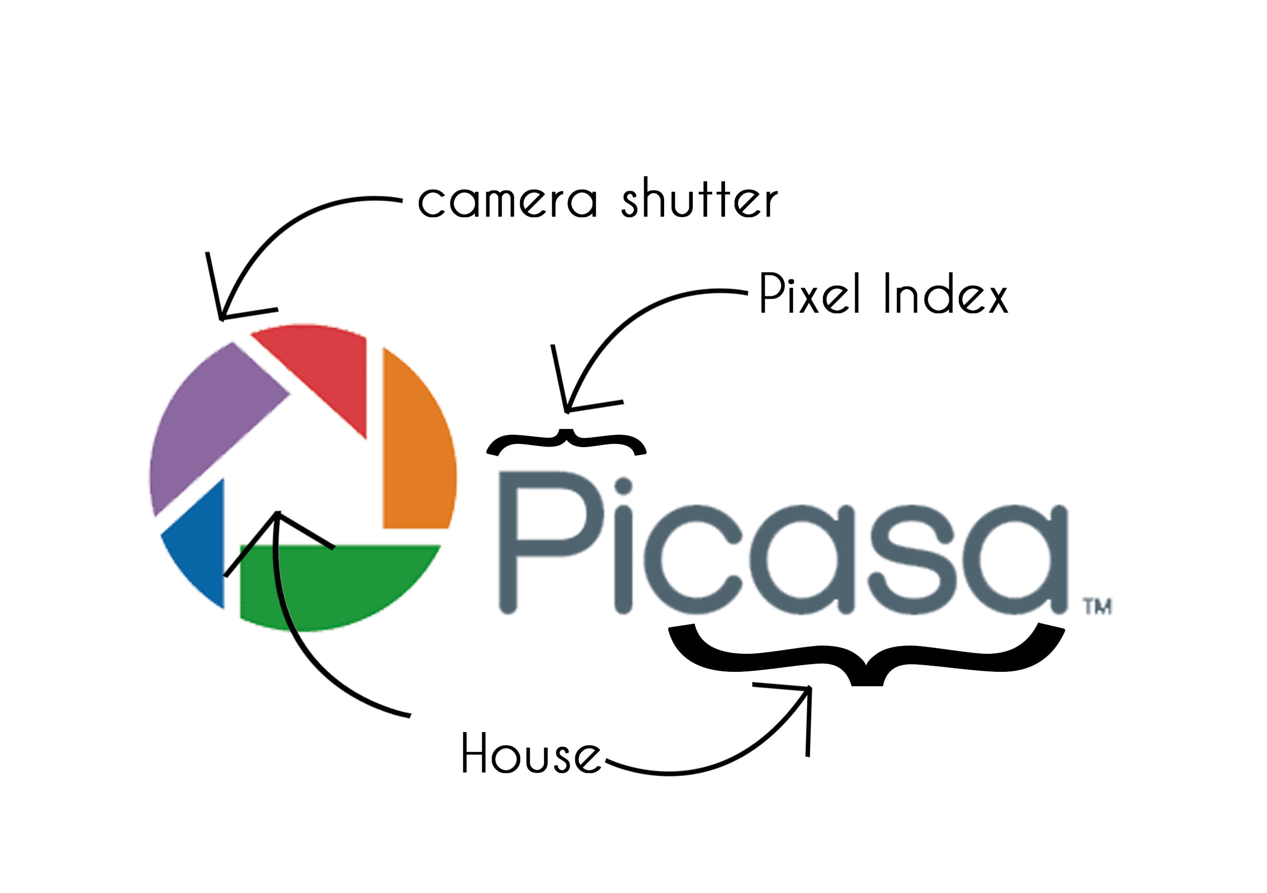
The Picasa logo holds a lot more than what meets the eye. The colorful portion of the logo represents a camera shutter while the white space within the logo represents a house. Casa means “house” in Spanish while “Pi” can be shorthand for Pixel Index. Put them together, and you have a house for your photos.
11. Formula 1 logo tells of passion and speed.
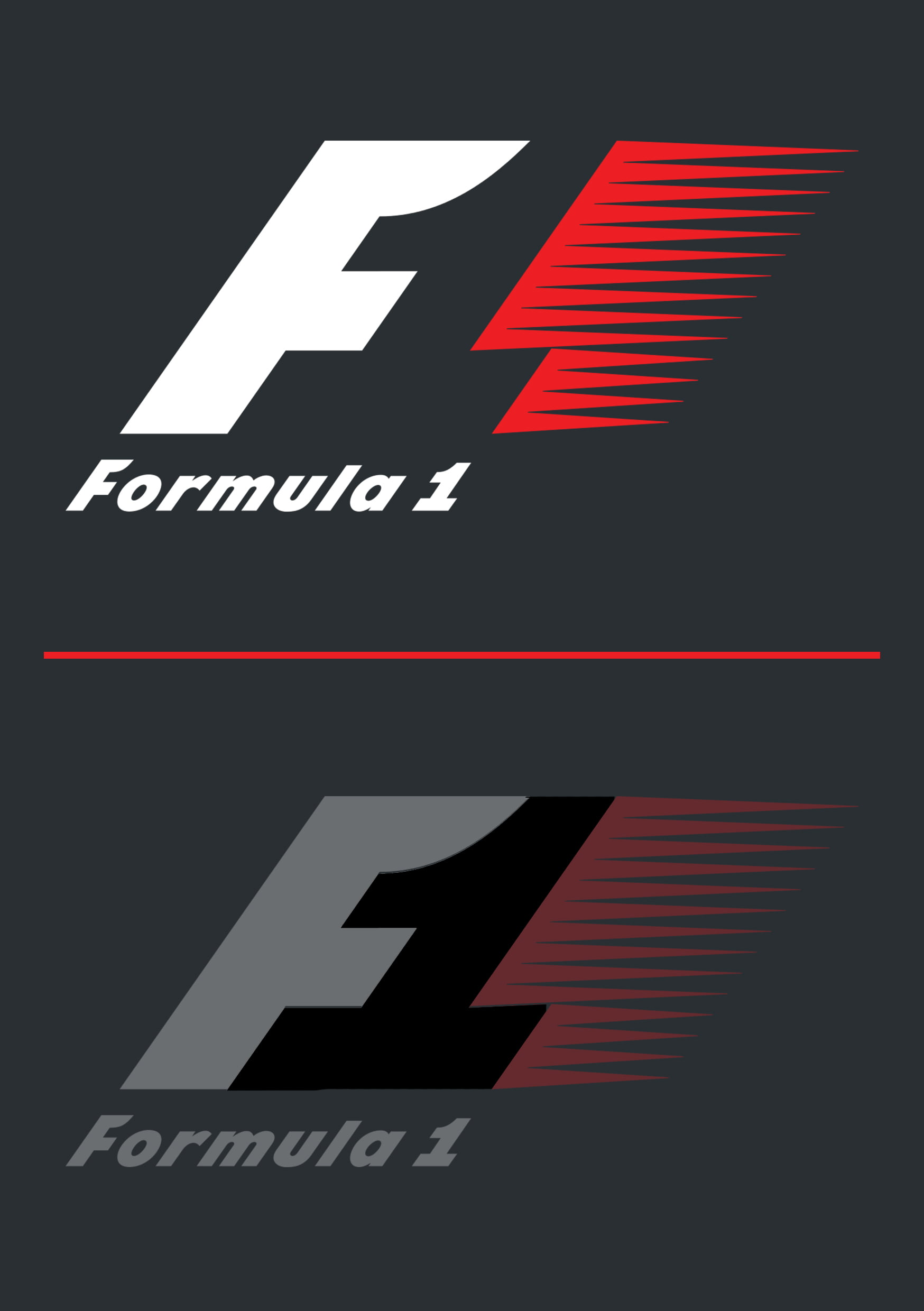
The auto-racing pioneer, F1’s logo consists of the bold, black F that stands for Formula and the red lined pattern signifying speed. But look carefully, 1 is disguised between the black and red spaces.
12. Nintendo GameCube encourages smart gaming.
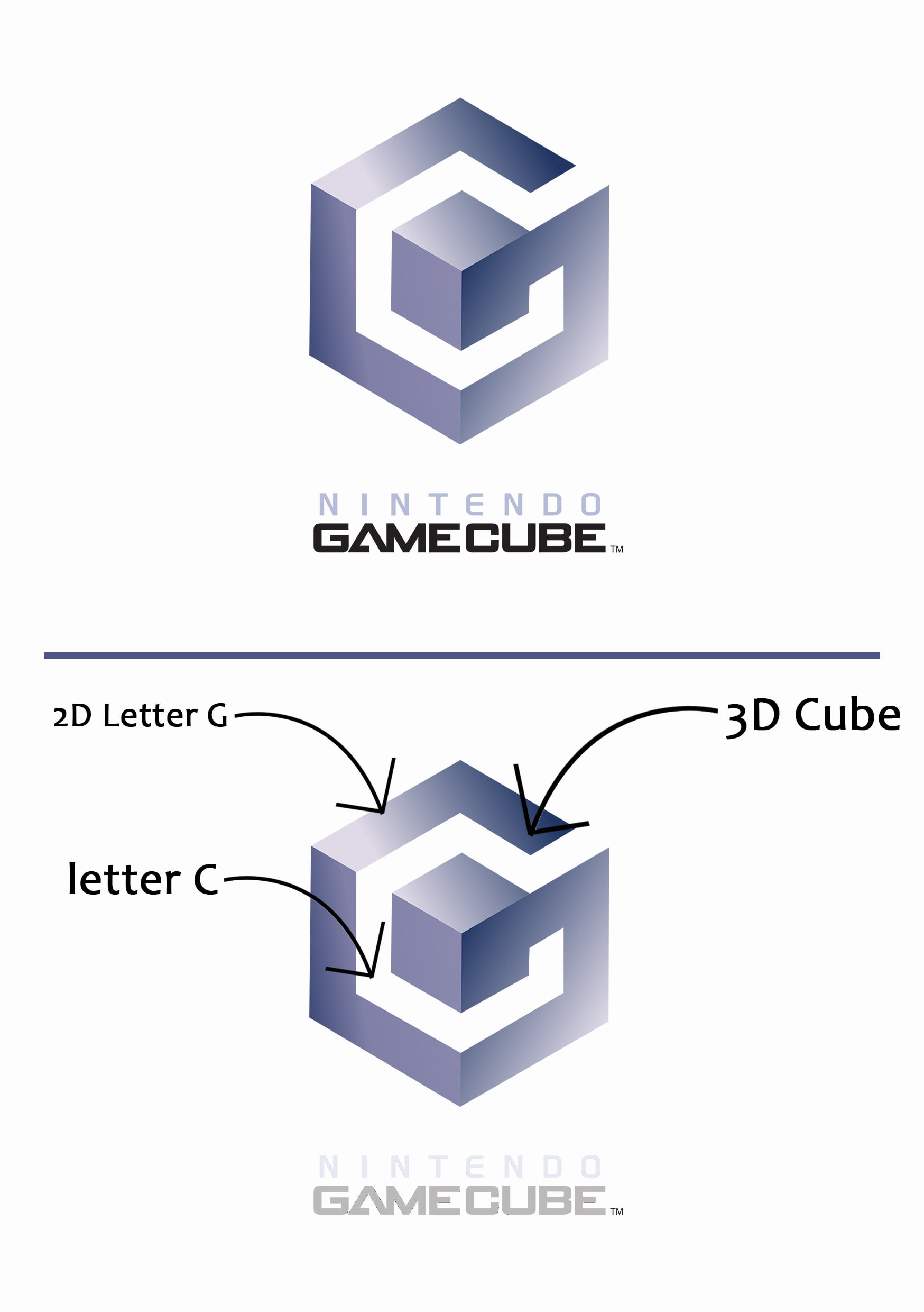
The Nintendo GameCube sports an extremely creative and intelligent logo. The purple-hued 3D cube also doubles as a 2D letter “G”. Further, the negative space within the Cube is the letter “C”. G + C = GameCube. You’ll also notice that the larger purple cube contains a smaller cube within it.
13. Fed Ex logo promises speed.
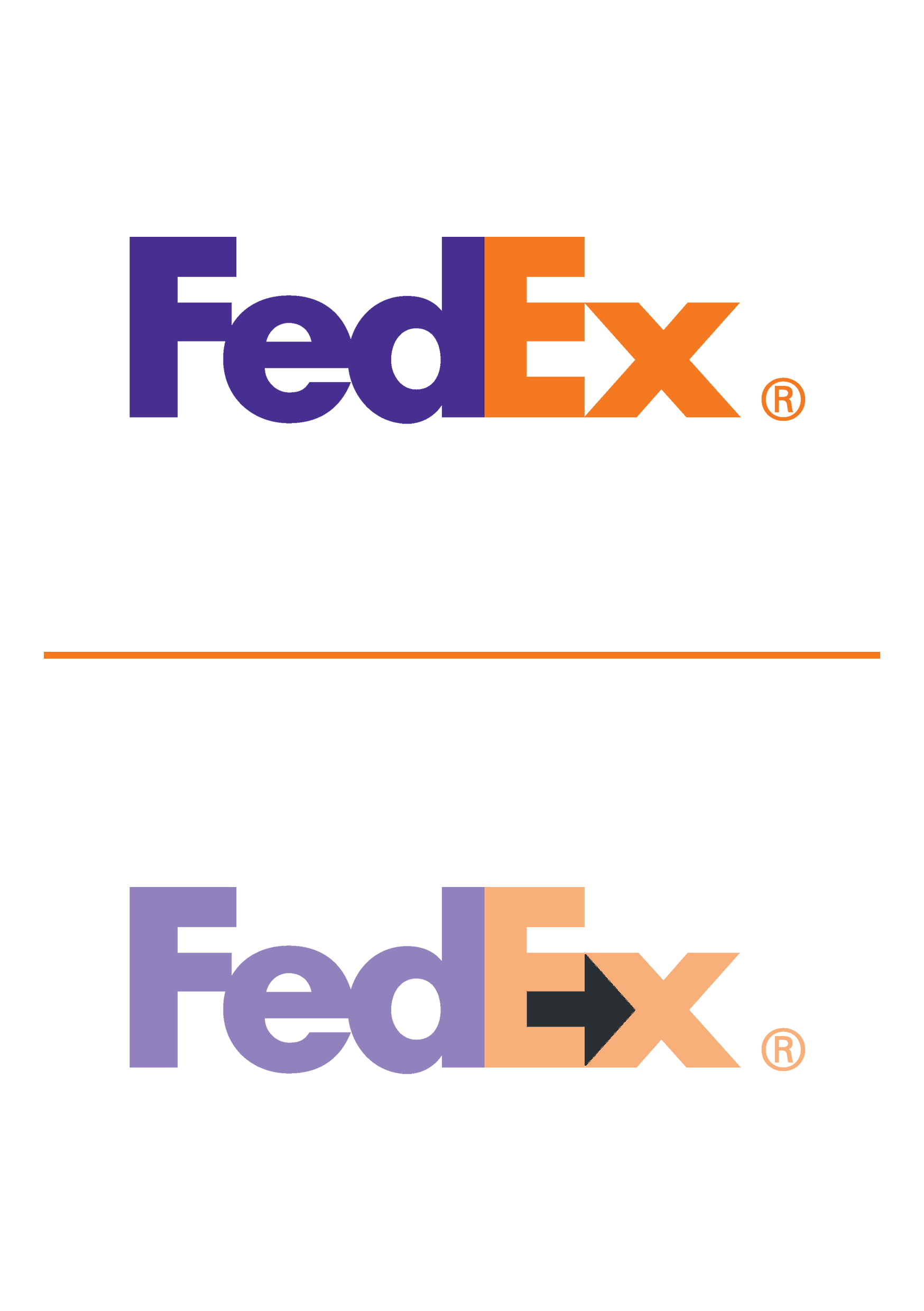
If you look closely there is a hidden arrow between E and X. It speaks of the company’s forward approach and outlook towards the future. Their speed and delivery accuracy is their motto.
14. Pinterest logo lets you discover and keep ideas.
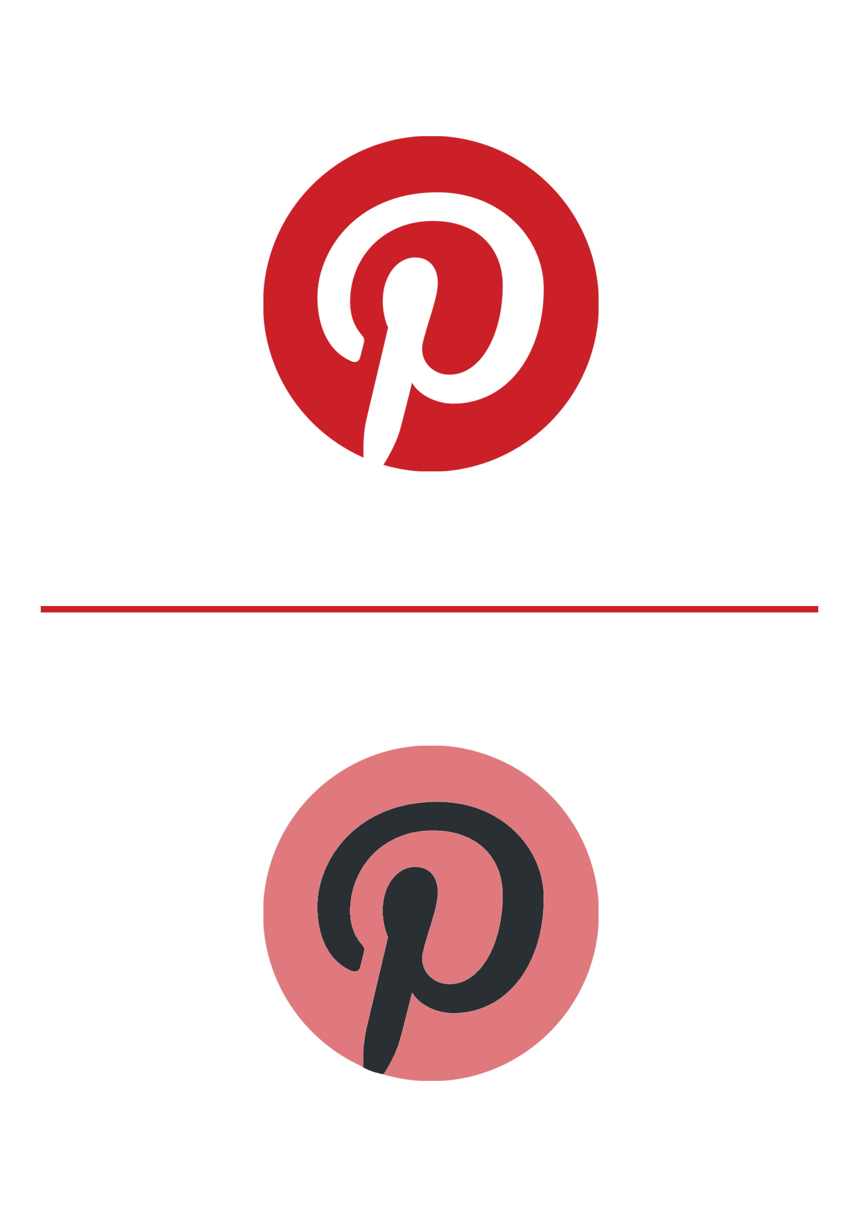
The P of ‘Pinterest’ represents a pin which suggests the idea of pinning desired web clippings on to boards on the site.
15. Unilever logo takes care of every need.

The U of Unilever has been creatively designed to include all aspects of the brand like recycle, lips for beauty and taste, water for freshness, spoon for nutrition etc.
16. Hershey’s Kisses logo has chocolates dipped in love.
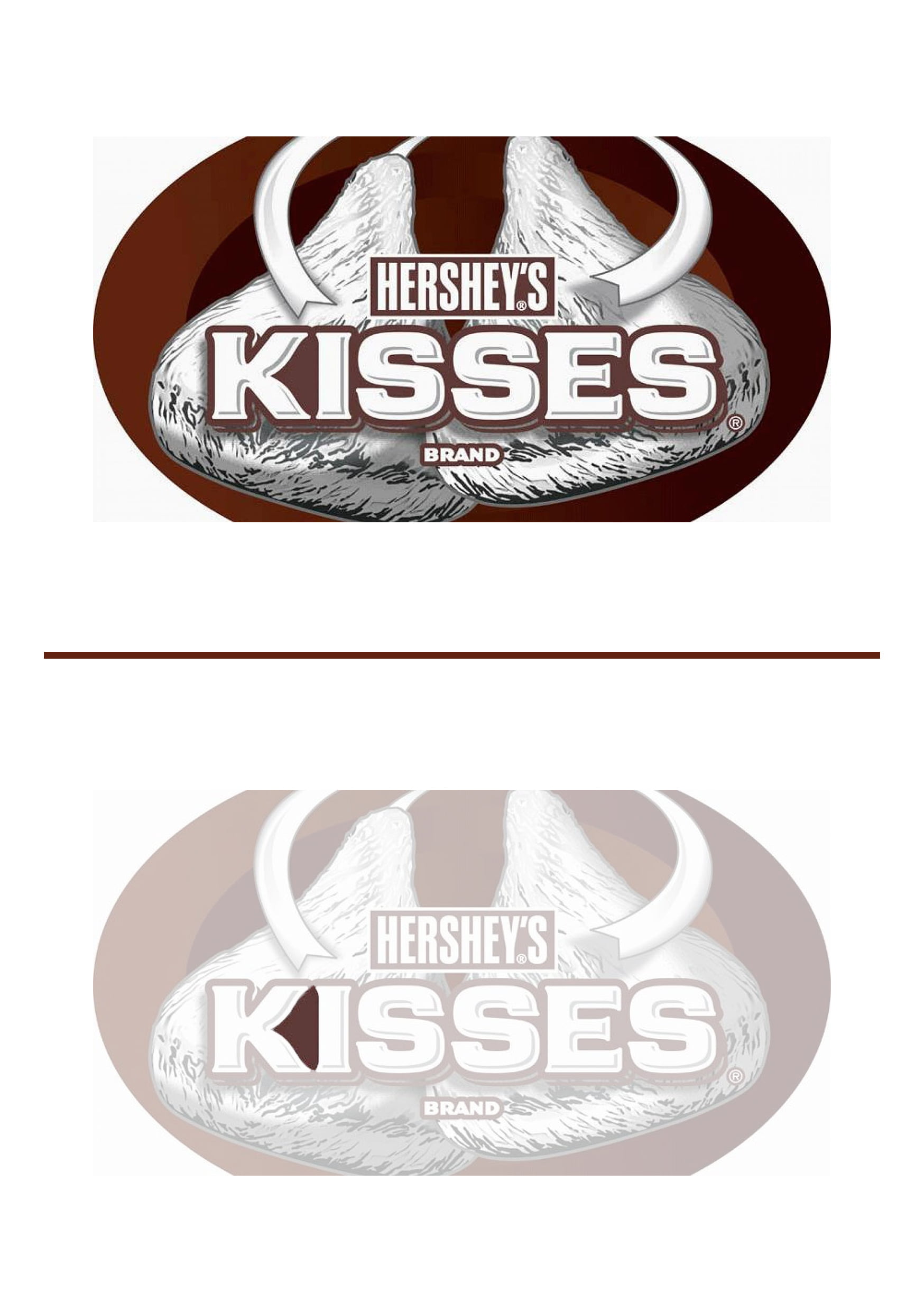
Hershey’s kisses chocolates are one of the most popular in America. Their unique shape has been incorporated in their logo. Look between the ‘K’ and ‘I’ and you’ll see a Hershey’s kiss in the negative space.
17. Gillette logo promises precision.
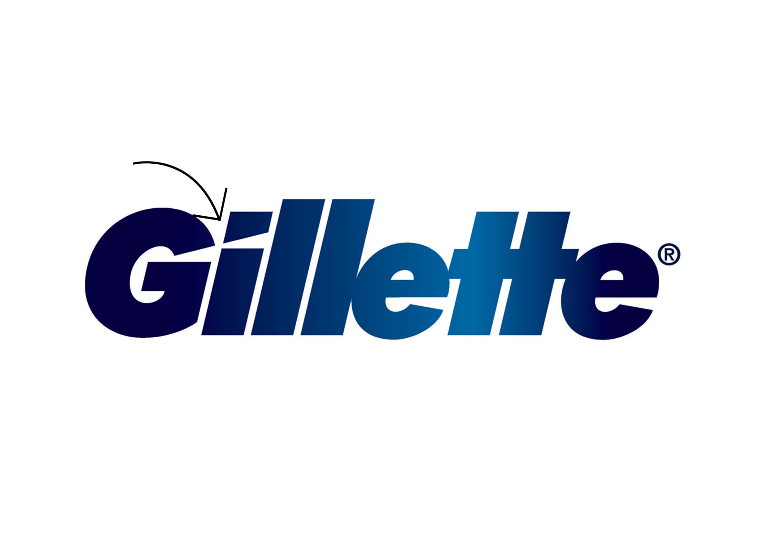
In the Gillette logo, ‘G’ and ‘I’ have been precisely cut razor-sharply to show precision and sharpness.
18. LG logo makes life good and fun.
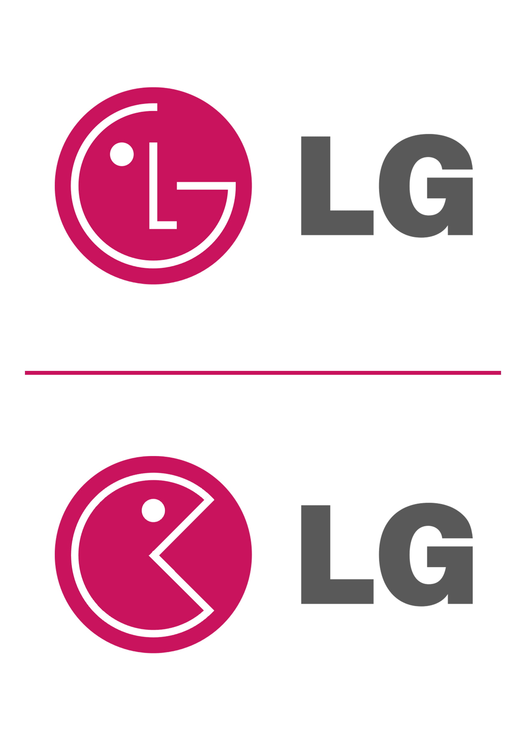
The LG logo is recognized worldwide on a number of products. But what you have been missing is that the ‘L’ in LG makes up the nose and the ‘G’ the rest of the face. If you join the nose, it is Pac-man, just slightly altered.
19. NBC logo is proud of what it broadcasts.
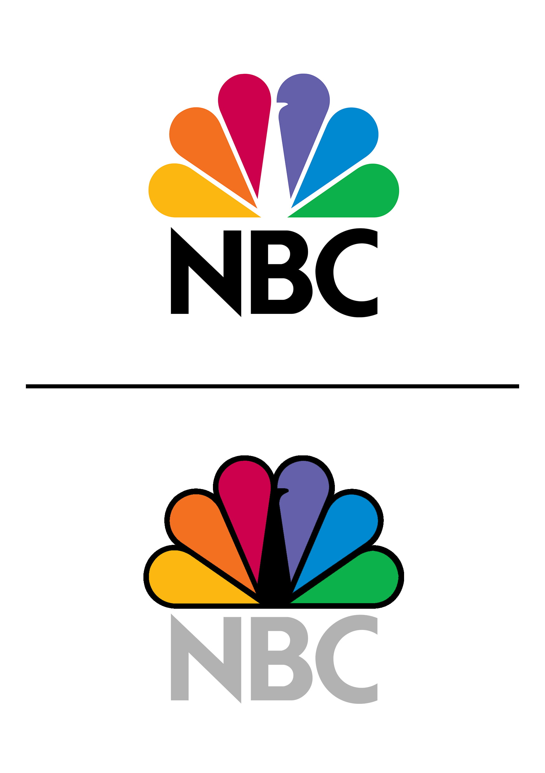
The NBC logo includes a hidden peacock above the above text which is looking to the right. Each of the peacock’s feathers represents a branch of the NBC Network: Entertainment, Stations, Network, and Productions. It also represents the company’s motto to look forward.
20. Mercedes-Benz logo dominates the road.
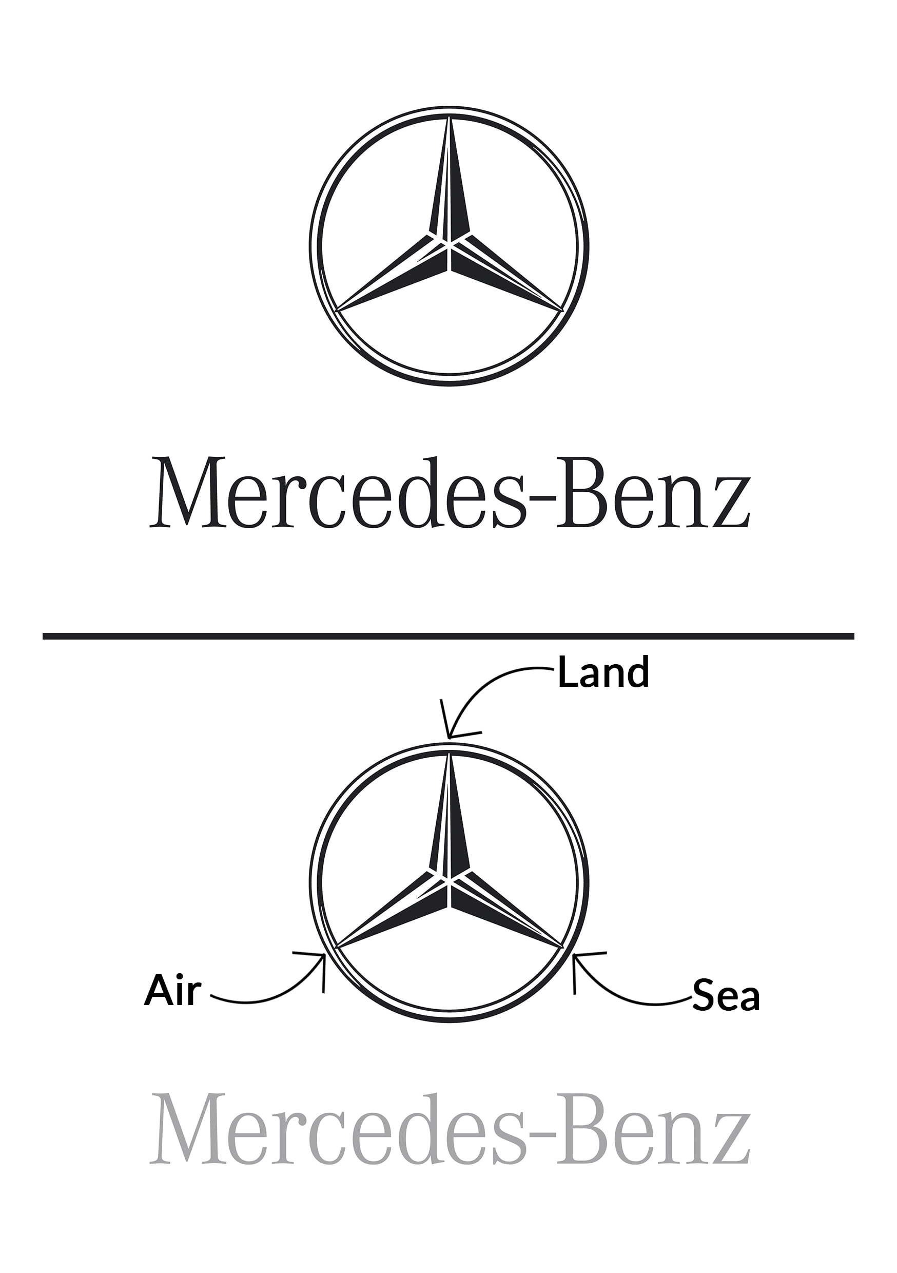
The logo of one of the foremost luxury car companies has a tri-star representing the companies dominance over land, sea and air. It is meant to symbolize universal motorization.
So aren’t these logos awe-inspiring? Have the designers been successful in conveying their idea? Tell us in the comments below.
Image Credits: Abhinav Jain


